Smart meter data: Time series clustering
September 26, 2015
Motivation
The utility industry is one of those sectors that so far have been almost immune to the recent data analytic sensation. This is largely resulted from the lack of data available. Traditional meter reading and billing happens only quarterly or semi-annually. Other types of customer interactions are also infrequent. Comparing to the huge amount of daily information generated for business like banks or e-commerce operators, from both customer transactions and market movements, the amount of data processed by utility service provider has very little potential to offer.
This is changing, however, through the increasing deployment of smart meters. With several automated meter readings every hour, energy retailers are receiving hundreds or thousands as much data as before. And those are greatly valuable data for it provides detailed consumption pattern of customer’s energy usage.
In this post I will use a sample set of smart meter data, provide some look on the daily usage patterns of different customers, and then explore ways to perform time-series clustering on those patterns.
Obtain the data
The sample data used here is from data.gov.au, which features electricity usage data of 31 households in NSW, Australia. The interval of meter is 30 minutes. You can also find more detailed description and supporting materials. It also provides a survey data sheet containing some basic demographic information for each household. The survey data could allow us to run some more complex prediction related analysis on energy usage. However in this post we will focus on usage pattern alone.
Note that the txt file is tab delimited, UTF-16 encoded and comes with a header row:
dat <- read.table(file="govhackelectricitytimeofusedataset.txt",
    sep="\t",header=T, fileEncoding = "UTF-16")
colnames(dat) <- c("customer_key","end_time",
    "general_supply","off_peak","gross_gener","net_gener")
The raw data structure likes below:
'data.frame':	618189 obs. of  6 variables:
$ customer_key  : int  8170837 8170837 8170837 8170837 8170837 8170837 8170837 8170837 8170837 8170837 ...
$ end_time      : Factor w/ 42024 levels "1/01/2012 0:29",..: 34400 34401 34402 34403 34404 34405 34406 34407 34408 34409 ...
$ general_supply: num  0.137 0.197 0.296 0.24 0.253 0.24 0.238 0.225 0.246 0.199 ...
$ off_peak      : num  0 0 0 0 0 0 0 0 0 0 ...
$ gross_gener   : num  0 0 0 0 0 0 0 0 0 0 ...
$ net_gener     : int  0 0 0 0 0 0 0 0 0 0 ...
We can then perform some cleaning and subsetting to get a reduced dataset, from here we will start using dplyr and reshape2 to make life easier:
require(dplyr)
require(reshape2)

dat$customer_key <- as.factor(dat$customer_key)
levels(dat$customer_key) <- paste("cust",seq(1,31,1),sep="_")

dat$day <- sapply(dat$end_time,FUN=function(x){
        strsplit(as.character(x),' ')[[1]][1]}) %>%
        as.Date("%d/%m/%Y")

dat$day_time <- sapply(dat$end_time,FUN=function(x){
			strsplit(as.character(x),' ')[[1]][2]})

m <- dat %>%
        select(customer_key,day,day_time,general_supply) %>%
        dcast(day + day_time ~ customer_key, value.var = "general_supply")
So we have divided date column into date and time, and converted the data into a wide format. This will be the starting point of our analysis.
Manipulation and Exploration
One thing we can notice in the dataset is that the time range covered by each household is actually different. It would be good to gain some visibility on this. And by visibility I do mean graphical visibility. Here is what I came up with:
require(ggplot2)

range.long <- m %>%
        select(-day_time) %>%
        group_by(day) %>%
        summarise_each(funs(mean(.,na.rm=T))) %>%
        melt(id.vars="day",na.rm=T) %>%
        rowwise() %>%
        mutate(value=strsplit(as.character(variable),split="_")[[1]][2]) %>%
        mutate(value=as.numeric(value)) %>%
        data.frame()

ggplot(range.long,aes(x=day,y=value,color=variable))+
	geom_line()+
	scale_y_discrete("Customer ID",breaks=1:31) +
	scale_x_date("Date Range",breaks="3 month") +
	theme(axis.text.x=element_text(angle=-45,hjust=0.001)) +
	guides(color=F)
The result I’m trying to achieve is to plot individual household vertical by their id index, and then show their date coverage through horizontal lines. The output looks like below:
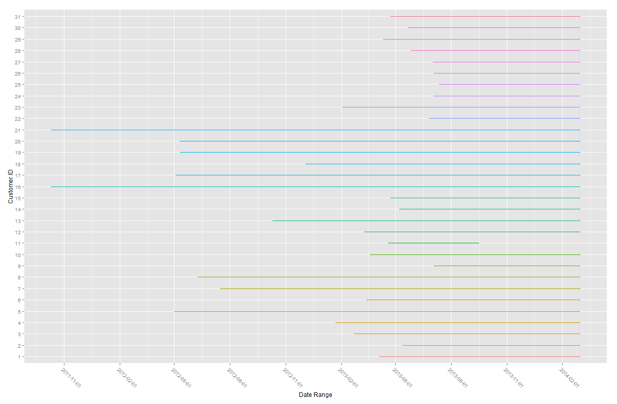
Most of the household had their usage recording ended during February 2014, while they started at different point of times. However No.11 there has a notably different date coverage to others. While this shouldn’t affect our analysis much, it is a potentially removable candidate if it’s necessary.
Now we can work on getting the daily usage patterns. This can be done simply by aggregating each households daily usage amount by taking the means. This is an obviously simplified approach as we are ignoring things like seasonal changes, weekends and holidays. We also introduce ‘chron’ package here for its specialty in manipulating times.
require(chron)

m2 <- aggregate(m[, 3:33], list(m$day_time), mean, na.rm=TRUE)
names(m2)[1] <- "day_time"
m.long <- m2[order(times(paste(m2$day_time,':00',sep=""))),] %>%
    melt(m2,id.vars="day_time")
m.long$day_time <- times(paste(m.long$day_time,':00',sep=""))

ggplot(m.long,aes(x=day_time,y=value))+
	geom_line()+scale_x_chron(format="%H:%M",n=4)+
	facet_wrap( ~ variable, ncol=5)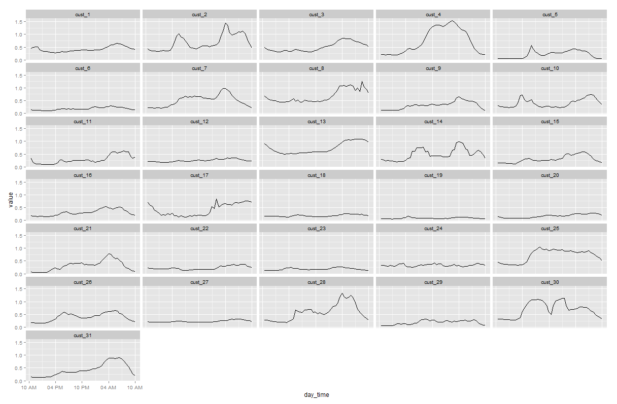
Clustering
For the times series clustering part I will apply library TSclust, a very nicely written package that both consolidates existing time series clustering libraries and provides its own solutions. The paper backing the library is through this link. It is definitely worth taking a look at the reasonings and walkthroughs in this paper. The library provides access to a wide range of dissimilarity measures to perform clustering. And it really depends on the user to make their own judgment on which measure to use. I am still learning the differences and application of different methods.
The purpose here is to cluster household’s daily electricity usage pattern in relative term, which means I will ignore the variation of absolute usage value between households, which could be contributed by factors like size of their house or family, energy efficiency of some home appliances etc. For this reason I will apply the dissimilarity method driven by correlation. Horizontal clustering is used here, script below measures dissimilarity, perform clustering and plot the dendrogram.
require(TSclust)

m.clust <- m2 %>%
	dplyr::select(-contains("time")) %>%
	data.frame()
rownames(m.clust) <- m2$day_time
dm.clust <- diss(m.clust, "COR")
hm.clust <- hclust(dm.clust,"complete")
plot(hm.clust)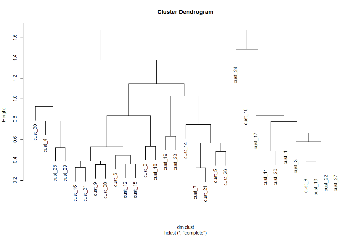
Unlike k-means clustering, number of clusters to use for horizontal clustering is not determined mathematically. We can combine the dendrogram with the daily usage pattern shown earlier. Here say we use 5 clusters. After assigning all 31 households into cluster groups we can again graph their usage pattern. To get a better comparative look we can use the grid.arrange function in gridExtra library.
require(gridExtra)

hclust.m <- data.frame(cutree(hm.clust,k=5))
colnames(hclust.m)[1] <- "cluster"
hclust.m$variable <- as.factor(rownames(hclust.m))
hclust.m$cluster<- as.factor(hclust.m$cluster)
hm.long <- merge(m.long,hclust.m,by="variable")

g1 <- ggplot(subset(hm.long,cluster=="1"),aes(x=day_time,y=value))+
	geom_line(aes(color=cluster))+
	scale_x_chron(format="%H",n=4)+
        scale_y_log10()+
	facet_grid( ~ variable)
g2 <- ggplot(subset(hm.long,cluster=="2"),aes(x=day_time,y=value))+
	geom_line(aes(color=cluster))+
	scale_x_chron(format="%H",n=4)+
        scale_y_log10()+
	facet_grid( ~ variable)
g3 <- ggplot(subset(hm.long,cluster=="3"),aes(x=day_time,y=value))+
	geom_line(aes(color=cluster))+
	scale_x_chron(format="%H",n=4)+
        scale_y_log10()+
	facet_grid( ~ variable)
g4 <- ggplot(subset(hm.long,cluster=="4"),aes(x=day_time,y=value))+
	geom_line(aes(color=cluster))+
	scale_x_chron(format="%H",n=4)+
        scale_y_log10()+
	facet_grid( ~ variable)
g5 <- ggplot(subset(hm.long,cluster=="5"),aes(x=day_time,y=value))+
	geom_line(aes(color=cluster))+
	scale_x_chron(format="%H",n=4)+
        scale_y_log10()+
	facet_grid( ~ variable)

grid.arrange(g1,g2,g3,g4,g5,nrow=5)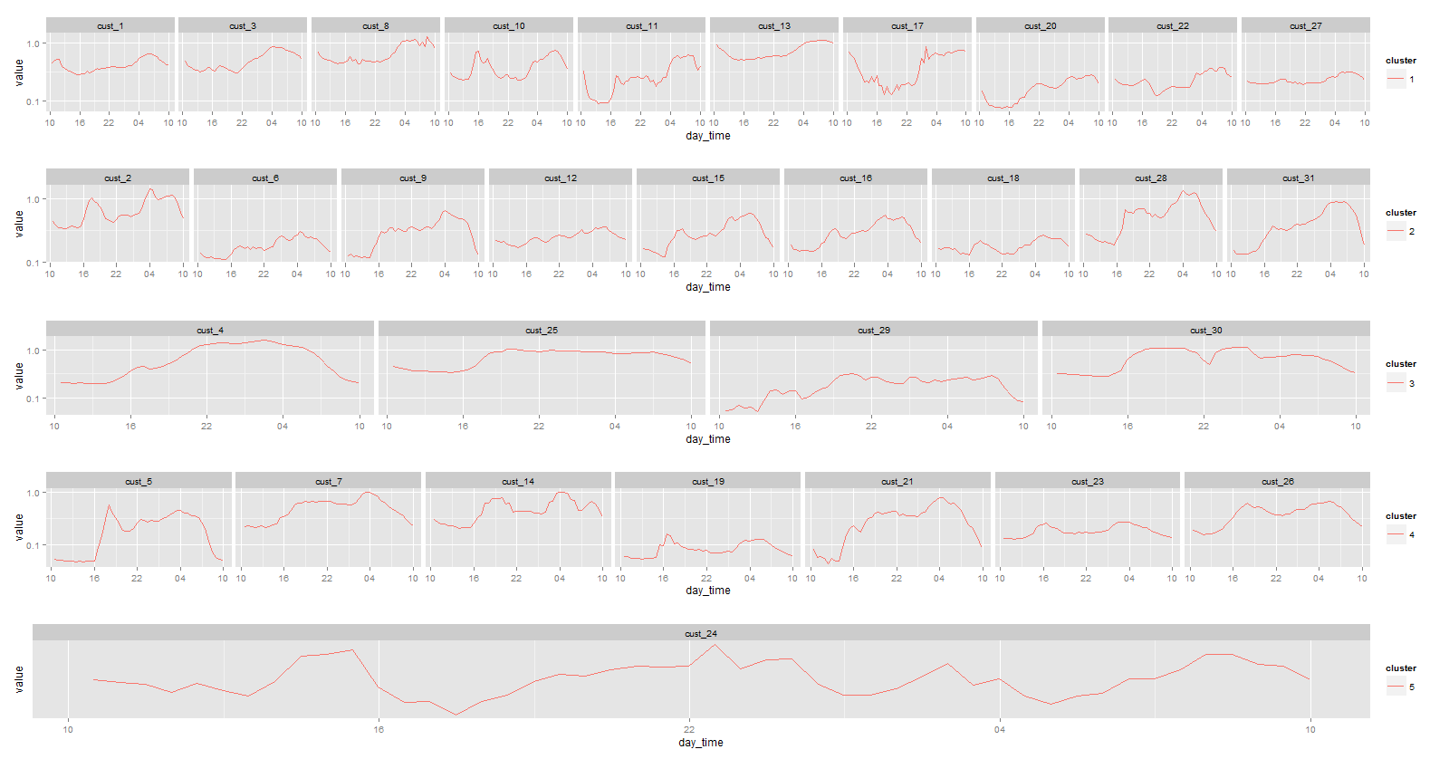
Now we have what we were looking for. We can see that in general there are some noticeable dissimilarities between clusters. For instance in cluster 2 subjects tend to have higher usage in the morning than in the evening, while in cluster 4 it is mostly the other way around. To further improve the result it will require much closer examination of the dataset and more refinement on modelling methods and assumptions. Statistical learning in time series is indeed a very interesting area that is also receiving lots of attention in the past decade. And I’m keen to see more real world application with it.
A bit more on smart meter
As I mentioned in motivation, the increasing adoption of smart meter provides great potential for data analytics in the power utility and more broad energy sector. At the moment it is not greatly welcomed by the customer (Stop Smart Meters Australia), since the cost of deployment is past directly to them. However it has also started to provide values to the customers, e.g. many retailers provide online portals or apps for the customers to check their live consumption, thus better budget decision and less bill shocks. In the end the most important effect is in the long term. Smart meter infrastructure lays a ground for more technological progress to the old-fashioned industry, which in turn will eventually make energy more efficiently used.