A visual comparison of long term US financial assets performance
September 20, 2015
Motivations
In Jeremy Siegel’s classic book Stocks for the Long Run, the author constructed a multi-line graph of long-term US investment total return indexes. It basically answers the question - “If you invest 1 dollar back in 1802, how much would that 1 dollar grow into if it is invested in a well-diversified portfolio of US stocks, US long term and short term treasury bonds, or gold?”. The insight draws from it supports the core argument of the entire book - that in the longer term stock providers superior return than all other major investment assets. In this post I will be looking at how to run a similar analysis with the aid of R, using publicly available data.
Obtain the data
With the original graph, the source data was obtained from multiple sources, some of which are either not publicly available or not easily accessible by non-academics. For our purpose here we will ease the requirement on the scale of data and try to find one source that provides the longest time range of the data we need. A very good tool we can use here is the online open data platform Quandle, where we can access huge range of economics and financial market data, mostly without any charge. And we can obtained them through R’s Quandle library, while performing some basic time series transformation along the way. The database we will focus on will be the Yale Department of Economics database. Majority of the datasets there are provided by Robert Shiller from his numerous researches. The S&P Composite (Yale) dataset consists of stock prices, dividends, long-term bond yields and CPI series, which is also one of the main data source for Dr Siegel’s research. The description of this dataset and links for the spreadsheets version can be viewed here. When I did the data extraction, the time range covered is from 1871-01-31 to 2015-08-31. Our short-term interest rate can be obtained from another stand-alone dataset named U.S. Stock Price Data; Real One-Year Interest Rate, also under the Yale database. For gold price series we can use the data provided by World Gold Council, however through Quandl we need to access and combine two datasets in order to get the time range we need. The R script for getting all the mentioned datasets are shown below.
require(Quandl)

# Getting the date through Quandl api

yaleComp <- Quandl("YALE/SPCOMP")
yaleST <- Quandl("YALE/SP_1YIR",start_date = "1875-01-31")
gld <- Quandl("NMA/HIST_GOLD_PR")
gld2015 <- Quandl("WGC/GOLD_DAILY_USD", collapse="monthly", start_date="2011-12-31")

# Adjust and join

colnames(yaleComp) <- c("Year","SP_Composite",
                        "Dividend","Earnings","CPI",
                        "Long_Interest_Rate","Real_Price",
                        "Real_Dividend","Real_Earnings","Cyclically_Adjusted_PE-Ratio")
yaleComp <- yaleComp[order(yaleComp$Year),]
yaleST <- yaleST[order(yaleST$Year),]

colnames(gld) <- c("Date","Value")
gld <- rbind(gld,gld2015)
gld <- gld[order(gld$Date),]
gld <- gld[months(gld$Date) == 'December',]
Note that I have joined two gold price series together. Data from NMA/HIST_GOLD_PR gives use everything from 1850 through to 2011, the rest until end of 2014 is provided by WGC/GOLD_DAILY_USD. Those two are effectively from the same source as mentioned before. The former one are annual data while later can be as precious as daily. Converting it to annual through collapse= argument has been troublesome. So I obtained monthly data and converted it to annually by filtering on month. Also note that across those time series, US short-term bond yields and gold index are annually, while all others are monthly data. This means those two series will appear smoother than the other series in the final graph.
Total Return and the plot
Now we have all the indexes ready. Our task here is to have all the return indexes starting at the same date, all at one dollar. To do time we need to define two functions.
return_calc <- function(value,dividend){
        if(missing(dividend)){
                return(c(0,(diff(value)/value[-length(value)])))
        } else {
                return(c(0,((diff(value)+dividend[2:length(dividend)])/value[-length(value)])))
        }
}
value_sim <- function(rr){
        sim <- rep(1,length(rr))
        for(i in 2:length(rr)){
                sim[i] = sim[i-1]*(1+rr[i])
        }
        return(sim)
}
The first function calculates the rate of return on every data point. Since we are looking at total return here, it also has an optional second argument for dividend. The assumption here is that all the dividend payments are invested back in the portfolio. The second function uses the output from the first function to calculate the simulated asset value at each data point. Next step is to use those two functions to calculate the simulated value movement for everything asset class we have. We will to subsets for some datasets here to ensure that everyone starts at the same day.
yaleComp.sub <- yaleComp[yaleComp$Year <= "2015-05-31" & yaleComp$Year >= "1875-12-31",]
yaleComp.sub$Dividend[months(yaleComp.sub$Year) != 'December'] <- 0
yaleComp.sub$n_s_rr <- return_calc(yaleComp.sub$SP_Composite,yaleComp.sub$Dividend)
yaleComp.sub$n_s_sim <- value_sim(yaleComp.sub$n_s_rr)
yaleComp.sub$Long_Interest_Rate[months(yaleComp.sub$Year) != 'December'] <- 0
yaleComp.sub$n_li_sim <- value_sim(yaleComp.sub$Long_Interest_Rate/100)
yaleComp.sub$n_cpi_rr <- return_calc(yaleComp.sub$CPI)
yaleComp.sub$n_cpi_sim <- value_sim(yaleComp.sub$n_cpi_rr)

yaleST$sim <- value_sim(yaleST$Value/100)

gld.sub <- gld[gld$Date <= "2015-05-31" & gld$Date >= "1875-12-31",]
gld.sub$return_rate <- return_calc(gld.sub$Value)
gld.sub$sim <- value_sim(gld.sub$return_rate)
In Yale’s S&P composite stock index dataset, both dividend and long-term interest rate shown are annual rates, although they are appearing every month. Thus I have made a some adjustments here so that they are only taken into account in return rate calculation once every year. We have made all the necessary modifications now. Getting the final multi-line graph using ggplot2 should be very straight forward.
options(scipen=999)

require(ggplot2)
require(ggthemes)

ggplot() + geom_line(data=yaleST,aes(x=Year,y=sim,color="US Short-Term Interest Rate")) +
        geom_line(data=yaleComp.sub,aes(x=Year,y=n_li_sim,color="US Long-Term Interest Rate")) +
        geom_line(data=yaleComp.sub,aes(x=Year,y=n_s_sim,color="US Stock")) +
        geom_line(data=yaleComp.sub,aes(x=Year,y=n_cpi_sim,color="US CPI")) +
        geom_line(data=gld.sub,aes(x=Date,y=sim,color="Gold")) +
        scale_y_log10() + labs(colour = "") + ylab("Return Index") +
        theme_hc()
options(scipen=999) makes sure the ticks on y-axis are not shown in scientific notation. The output looks like below. 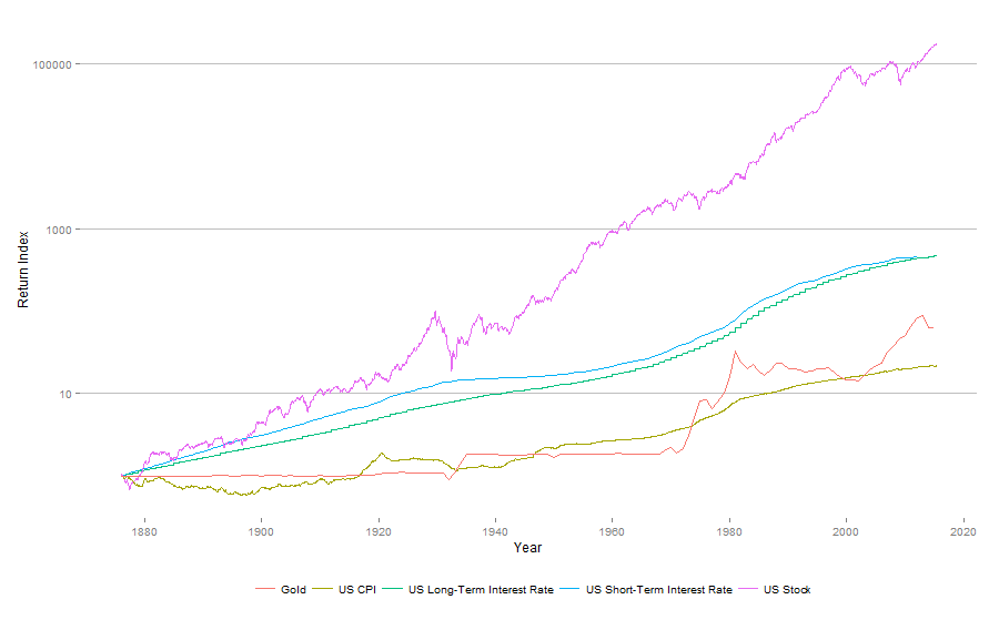
Conclusion
Within the incredible 200-year period that the Jeremy Siegel’s research covers, a dollar invested in stocks in 1802 will eventually become $12.7 million in year 2006 (in nominal term), while the number for bonds, bills and gold are $18,235, $5,061 and $32.84 respectively. By using the publicly avaible data through Quandl, we are able to construct a similar graph by ourselves. Our graph covers date range starting at a much later year, while extending the end year to 2015. The graph confirms stock’s superior ability on growing investor’s portfolio, over the past 140 years. However by focusing the data on the last century we are also witnessing some more volatile movements (I shall update Jeremy Siegel’s original graph later when I have a chance).